Why Piercing Studios are Starting to Look Like Galleries
Why Studios Are Starting to Look Like Galleries
How architecture, light, and layout turned piercing from a service into an experience.
Once upon a time, a piercing studio was a metal chair, a bright lamp, and a display case full of steel. The lighting was functional, the walls were loud, and the décor was an afterthought. You went for the thrill, not the view.
Now, piercing spaces are calm, bright, and beautifully composed. They look less like tattoo shops and more like boutique galleries, all light wood, matte metal, and careful symmetry.
Clients whisper instead of shout. Jewellery sits under glass like art. Even the autoclave has its own minimalist shelf.
This is not coincidence. It’s the result of a global aesthetic shift: design, architecture, and brand storytelling have become as essential to piercing as hygiene and precision.
The Space as Part of the Service
Walk into any leading piercing studio today and you’ll notice something: the room feels designed for you to exhale.
Calm replaces chaos
The loud music and adrenaline of early studios have given way to an atmosphere closer to wellness than rebellion. Clean lines, soft textures, and balanced light communicate safety and sophistication before a single word is spoken.
Clients arrive anxious and leave composed, not because the process changed, but because the environment told them they were in good hands.
The experience economy
People no longer just buy products or services; they buy experiences. Design-led studios understand this. Every square metre contributes to narrative, from the entry sequence to the placement of mirrors and the rhythm of movement between consultation and procedure.
The piercing itself is only one part of the choreography.
The Architecture of Trust
Layout and flow
Modern piercing spaces are organised with intent.
- Defined zones: reception, jewellery display, consultation, sterilisation, procedure, and aftercare, each distinct yet visually continuous.
- Transparent hygiene: sterilisation rooms visible through glass partitions; clients see precision rather than mystery.
- Circulation: curved corridors, open sightlines, and minimal clutter reduce anxiety and create spatial confidence.
Why it matters
Architecture tells clients where they stand, literally. When flow is intuitive, clients never feel lost. When sightlines are open, nothing feels hidden. Trust begins with transparency, and layout is the language that communicates it.
Case study: The Glass Wall
The “glass sterilisation room” has become symbolic of modern piercing design, a literal display of hygiene. It turns safety into theatre. Clients watch tray preparation like a performance of care. What was once hidden backstage now happens centre stage.
That transparency elevates the piercer’s role from operator to artisan.
Material Matters
Every surface in a studio speaks, not in colour, but in texture, tone, and tactility.
Clean doesn’t mean cold
A well designed studio balances clinical precision with visual warmth. Sterility must be visible but not intimidating.
Material palette essentials:
- Glass: for display, reflection, and visibility.
- Metal: stainless steel for hygiene, brass or brushed gold for warmth.
- Stone and terrazzo: grounding, durable, timeless.
- Soft woods: to diffuse the coldness of medical-grade materials.
- Matte finishes: reduce glare and photograph beautifully.
The invisible logic
Every texture choice is practical before it’s pretty. Non-porous counters, coved skirting, and integrated sinks aren’t just design flexes, they are infection control features disguised as style.
The best design in piercing is invisible: it looks aesthetic but behaves medical.
Light: The Silent Tool
Lighting defines emotion. Too bright, and a studio feels like a hospital. Too dim, and precision suffers. The best piercing studios use layered lighting, ambient, task, and accent, to control atmosphere and highlight craft.
Three layers of modern piercing light
- Ambient light: soft overhead illumination, often diffused or indirect. Creates calm and prevents harsh shadows on skin.
- Task light: focused beams at piercing stations. Adjustable, colour balanced for accurate skin tone reading.
- Accent light: directional light for jewellery displays, feature walls, and mirrors.
The colour temperature sweet spot
Between 3,000 K and 4,000 K, warm white to neutral, offers both clinical clarity and visual comfort. Lighting designers call it “daylight calm.”
Lighting isn’t decoration, it’s reassurance. It guides the eye, defines hierarchy, and photographs perfectly for social media.
A well lit studio is a marketing strategy that doubles as a safety feature.
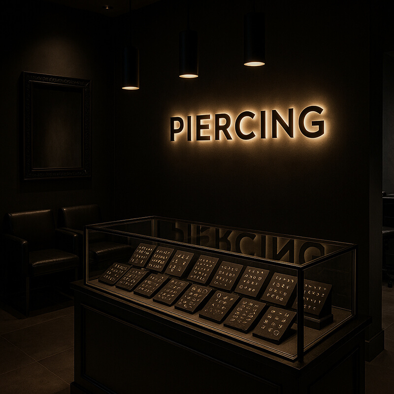
Displaying Jewellery Like Art
The new retail language
Jewellery display has evolved from cluttered racks to curated installations. Pieces are spaced, categorised by material, and lit individually. Each one sits on fabric, stone, or custom acrylic, not plastic cards.
The message is subtle but powerful: this isn’t stock; it’s sculpture.
The gallery metaphor
Studios borrow directly from galleries, minimal presentation, quiet lighting, white space. This aesthetic changes how clients perceive value. Gold feels precious because it’s treated that way.
Clients buy faster when they can appreciate detail. The experience of selection becomes part of the ritual.
Digital integration
Many modern studios use digital catalogues or screens beside displays, showing prices, materials, and origin. It’s functional transparency, and it reinforces the jewellery as art narrative.
The Sound and the Scent
Small details transform environments from good to unforgettable.
- Sound: low volume ambient music, curated playlists, soundproofing panels. Silence between words matters.
- Scent: neutral or lightly botanical scents calm nerves and clean the sensory palette.
- Temperature: consistent warmth without humidity ensures comfort and sterility.
These details don’t photograph, but they stay in memory, the subtle sensory branding that makes a client say “It just felt good in there.”
The Brand as Architecture
Design consistency
Modern studios align visual identity across space, logo, and online presence. Fonts on the wall match fonts on the website. Colour palettes stay consistent between social media grids and painted surfaces.
Brand architecture creates subconscious recognition, trust before transaction.
The role of restraint
The strongest brands resist clutter. They use minimal signage, let materials speak, and keep messaging simple. The silence of space becomes a statement of confidence.
In design terms, restraint reads as refinement, and refinement reads as expertise.
The Psychology of Calm
Behind all the design decisions lies a deeper motive: to create calm.
What calm communicates
- Safety: clean lines signal control and order.
- Competence: minimalism implies nothing is left to chance.
- Confidence: quiet spaces suggest authority, not uncertainty.
Clients interpret visual order as professional order. Every detail, from the alignment of chairs to the polish of mirrors, builds subconscious assurance.
The more control you show in your space, the more control clients assume you have in your technique.
Studios as Extensions of Jewellery Brands
Many piercing studios now operate like jewellery boutiques that happen to offer piercing, not the other way around.
The jeweller’s mindset
- The piercing is the service; the jewellery is the product.
- The studio design reflects the jewellery’s tone, luxurious, minimal, elegant.
- Staff are trained to discuss craftsmanship, materials, and provenance.
Why this works
Clients connect more deeply with artistry than with anatomy. When piercing studios adopt the visual and emotional cues of high jewellery brands, they elevate perception for the entire profession.
A beautiful space doesn’t just sell more jewellery; it sells respect for the process.
This philosophy aligns with the industry’s new identity: piercers as jewellers who pierce, not piercers who sell jewellery.
Designing for Photography
Social media is the new showroom. Every wall, corner, and surface is a potential photo backdrop.
Designing with the camera in mind
- Neutral walls enhance jewellery colour.
- Soft light eliminates harsh shadows on healed ears.
- Consistent background tones create brand recognition online.
Studios now design layouts that double as content studios, same lighting for procedure and photography, same angles that serve both clients and campaigns.
In essence, the studio is part workspace, part set design, and every photo taken becomes free advertising.
Accessibility and Inclusivity in Design
The best studios of the future are not just aesthetic; they’re accessible.
- Step-free entries and adjustable piercing chairs.
- Neutral bathrooms stocked with hygiene essentials.
- Quiet areas for clients with sensory sensitivity.
- Gender-neutral language and signage.
Design isn’t inclusive because of statements, it’s inclusive because of choices.
The piercing industry’s visual maturity must include physical empathy. The future studio feels safe for everyone who walks through its door.
The Return of Craft
After all the glass, lighting, and branding, the purpose of design remains simple: to honour craft.
A clean, beautiful environment doesn’t distract from the piercing, it frames it. Like art on a wall, a well pierced ear deserves presentation that respects its precision.
Design doesn’t replace authenticity; it amplifies it.
The Takeaway
Piercing studios started to look like galleries for one reason: because piercing finally learned to treat itself like art.
The new generation of studios understand that architecture, light, and layout are not vanity, they’re vocabulary.
The room teaches the client what to expect before a single word is spoken. It tells them: You are safe. This is serious. And this is beautiful.
Design isn’t decoration, it’s communication.
Piercing’s new spaces don’t scream identity; they whisper it. And in that quiet, the industry finally found its voice.